|
By Hannah Hoff
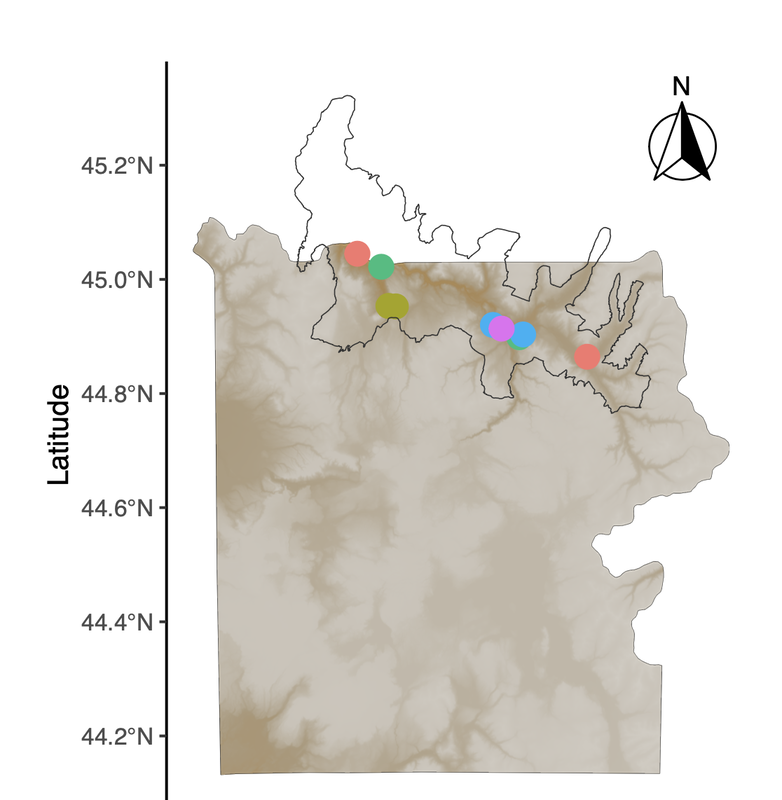
The most recent map-making tutorial focuses on unlocking the potential of rasters. We start by adding hillshade, which provides a clearer picture of the topography of the area by mimicking the sun's effects (illumination, shadows) on hills and mountains, which is particularly useful when mapping a place like Yellowstone National Park. However, when adding multiple layers onto a map, we suddenly end up with a number of different legends which may vary in utility and make the map look "busy." Simple functions allow us to suppress legends and guides that aren't useful, while retaining those that are. As usual, using well-documented and flexible packages like ggplot2 allow us to easily incorporate those functions, which may make downstream figure formatting more efficient. Thanks to the Kartzinel Lab for sharing ideas about useful map elements in a recent lab meeting :) A link to this PDF tutorial is available here. A link is also be posted on the Lab Wiki, where we are making an effort at compiling useful computing resources. Hannah has also set up a GitHub repository for these tutorials (https://github.com/hkhoff/Map-making-in-R-tutorials-), which includes the R code used in each tutorial, and the ('dummy') data that was created as an example of what sorts of data might be fed into the code; both files can be downloaded for a more interactive tutorial experience :)
0 Comments
By Hannah Hoff
Our last map-making tutorial provided code for basic sampling maps in R. In a continued effort to demystify the world of spatial analysis, Hannah has created a tutorial that builds on that foundation to share some useful functions for tailoring map designs to different types of studies. This tutorial uses a "finalized" map from Hannah's earlier post to create a map inset, which allows us to zoom in on areas of interest (sampling points, population ranges, etc.). This may be particularly useful for studies where sampling occurs in a very small area relative to the broader landscape, or in cases where there is substantial visual overlap between sample points. As some of our work in Yellowstone is focused on smaller areas, map insets have become a necessary part of our map-making pipeline! A link to this PDF tutorial is available here. A link is also be posted on the Lab Wiki, where we are making an effort at compiling useful computing resourcesHannah has also set up a GitHub repository for these tutorials (https://github.com/hkhoff/Map-making-in-R-tutorials-), which includes the R code used in each tutorial, and the ('dummy') data that was created as an example of what sorts of data might be fed into the code; both files can be downloaded for a more interactive tutorial experience :) By Hannah Hoff
With many thanks to Hannah, map-making projects in the lab just got easier! Here is a detailed example of how to make maps in R that are both informative and visually striking. From the most basic building blocks, Hannah works through how to add detail to the map using well-developed R packages. The end result is a map that shows the locations of study sites or sample collections based on 'dummy data' that are not unlike the list of places where we work in Yellowstone National Park. Need to make an overview figure about your field sites for an upcoming manuscript or presentation? Make sure you say thanks to Hannah! :) A link to this PDF tutorial is also posted on the Lab Wiki, where we are making an effort at compiling more useful computing resources. |
AuthorComputational resources kindly contributed and explained by members of our community. Archives
May 2023
Categories
All
|

 RSS Feed
